Collaboration Process
To support the overhaul, we partnered with an external design agency to define a new visual language.
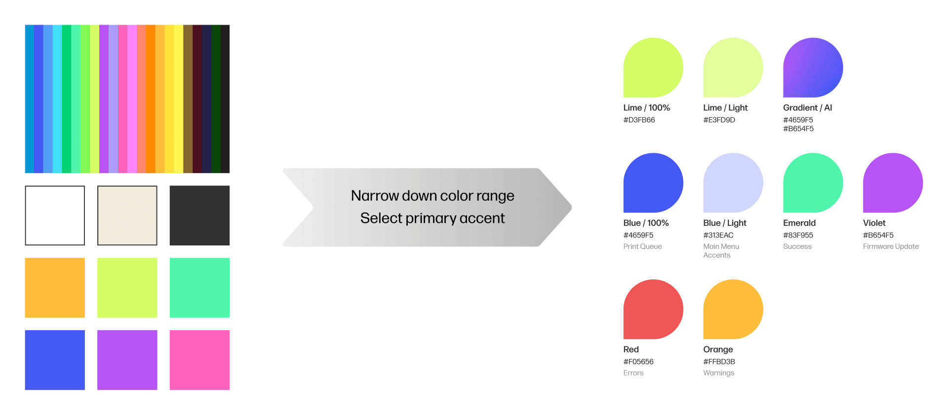
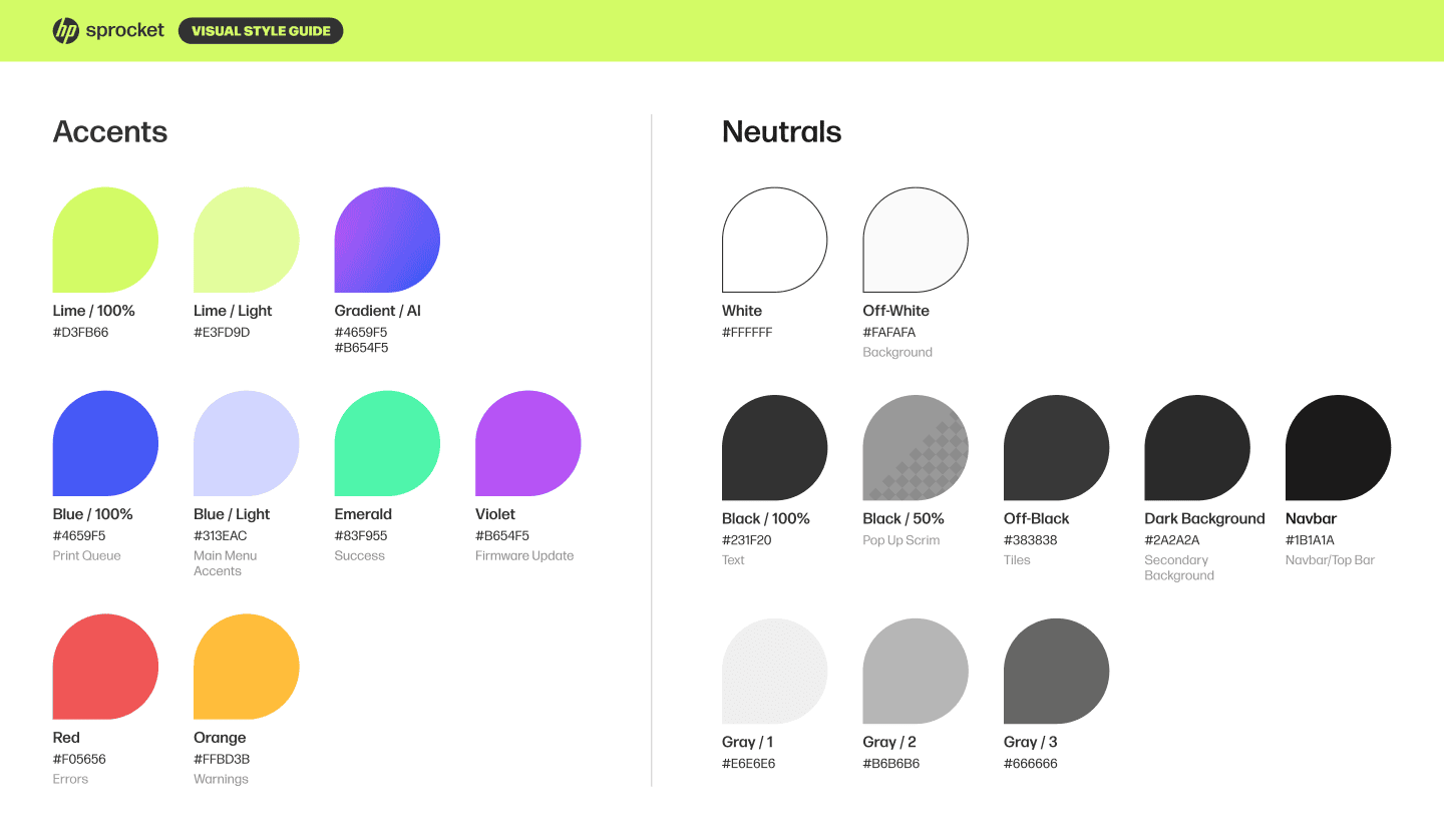
We provided: A handpicked set of colors from HP brand guidelines.
They returned: A narrowed down list of colors and the primary accent to work with.
We provided: Low fidelity wireframes and a vision for the visuals.
They returned: Multiple concepts for the final visuals.
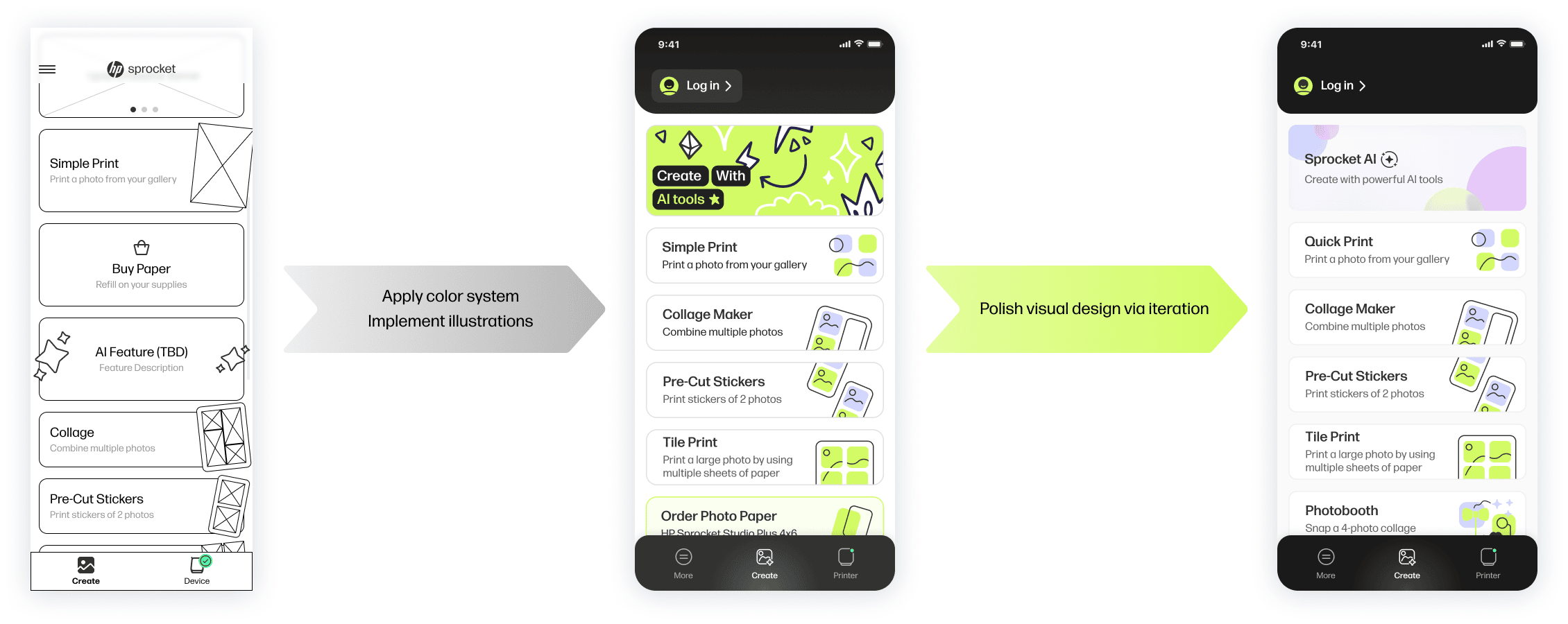
We continued to iterate on the selected visual direction until we were satisfied with the new look of Sprocket.
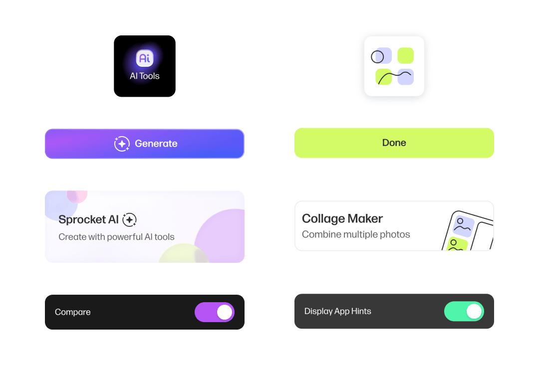
The final look of is a mix of the fun & casual nature of instant photos and a reminder that Sprocket is a polished, modern piece of technology.
Scaling Across Printer Models
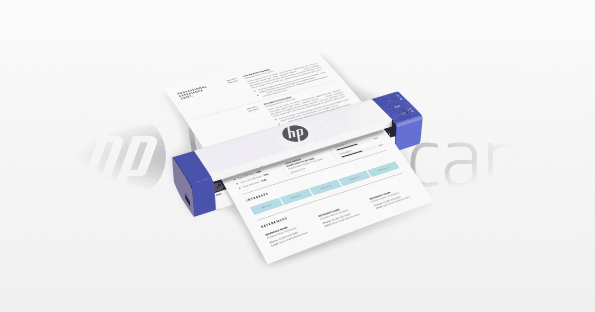
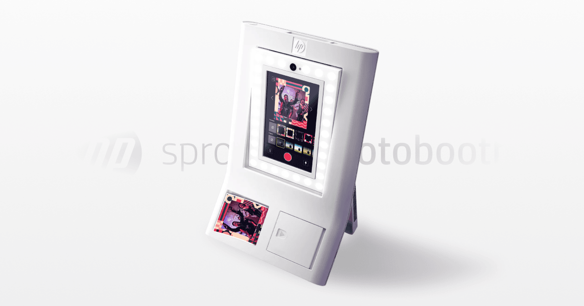
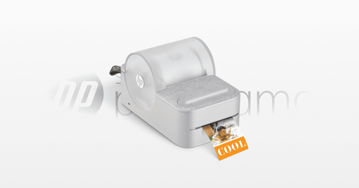
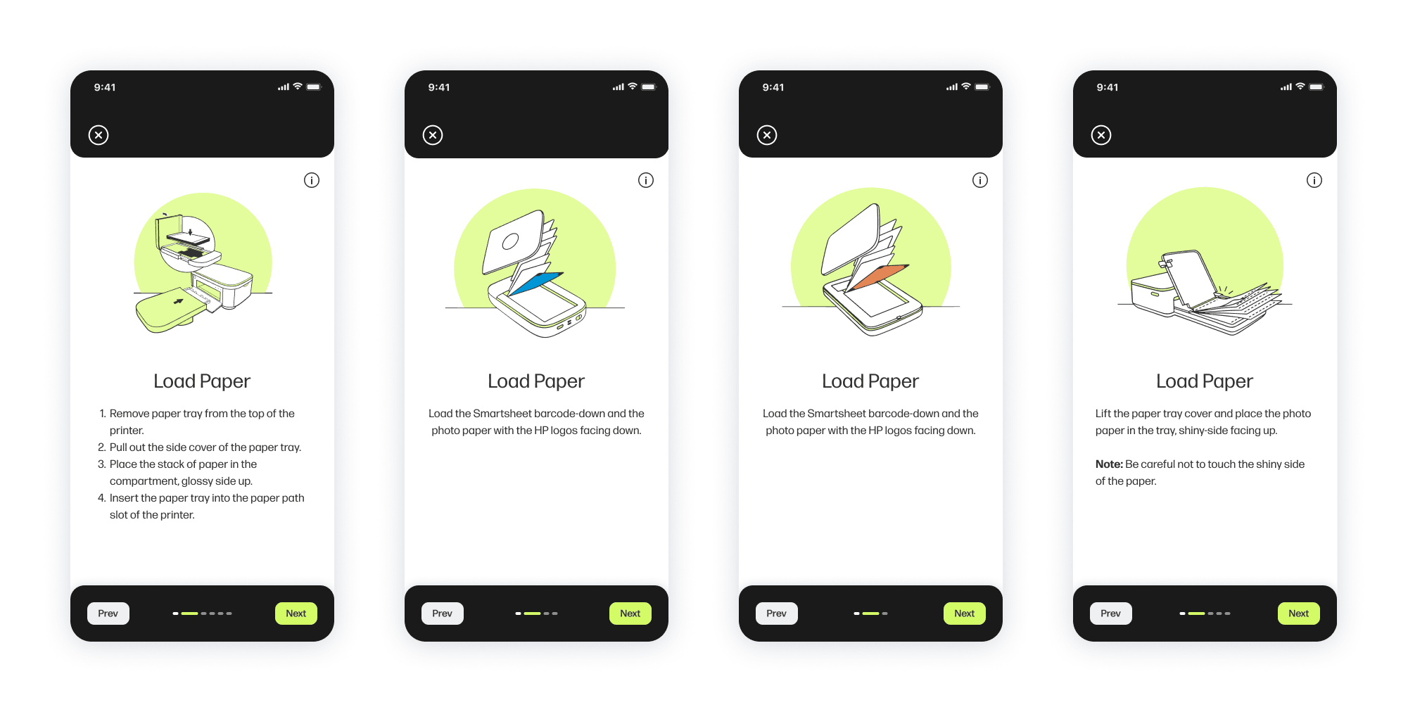
There were many considerations to take note of to accommodate all Sprocket models for one app.
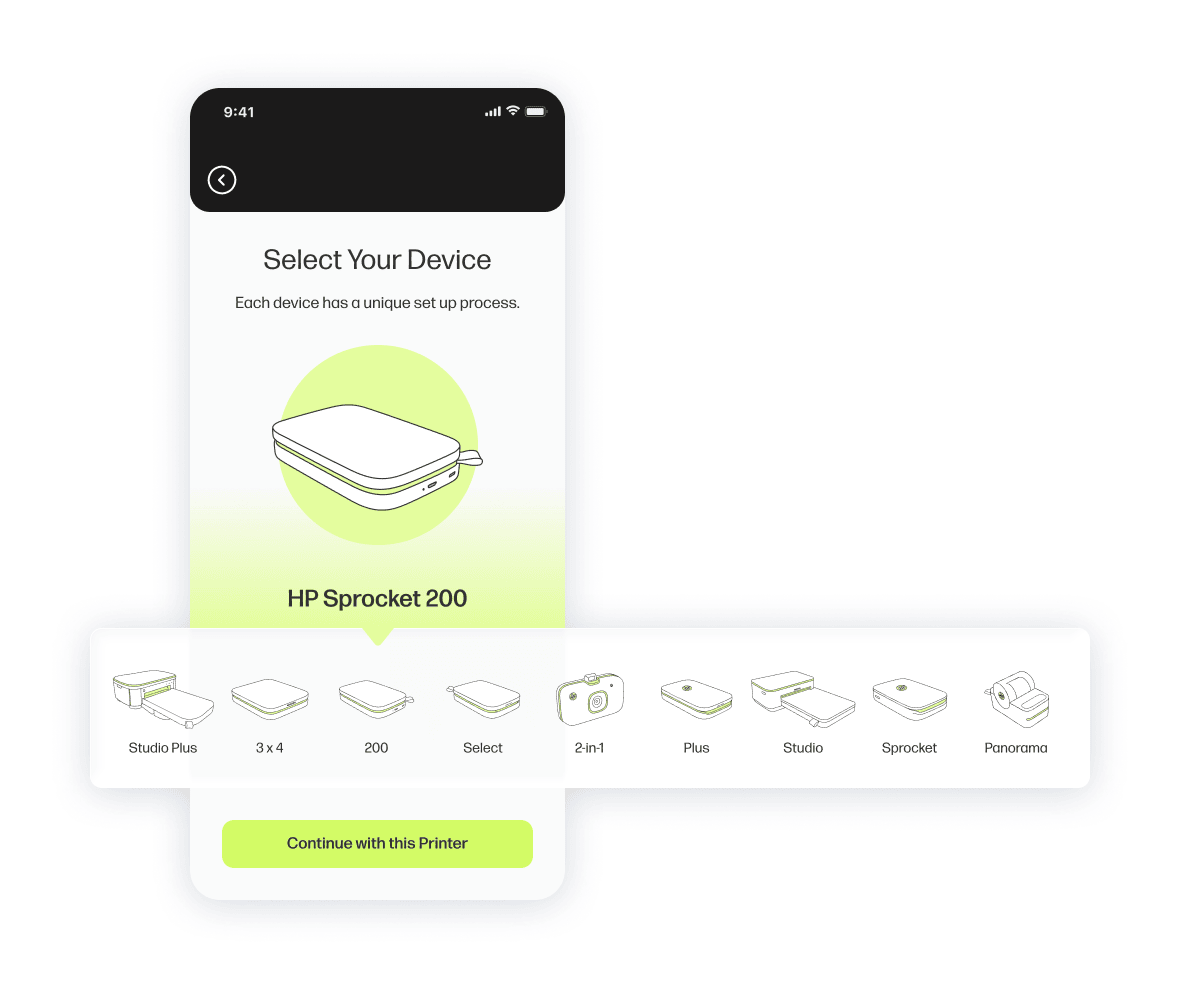
For example, each of the devices had their own unique setup process that had to be accounted for within the app. Depending on the user's device selection, equivalent steps in the setup will be accompanied by varying graphics and instructions.
To prevent fragmentation:
Core flows were shared across models
Conditional logic handled model-specific behavior
Components supported dynamic states


